
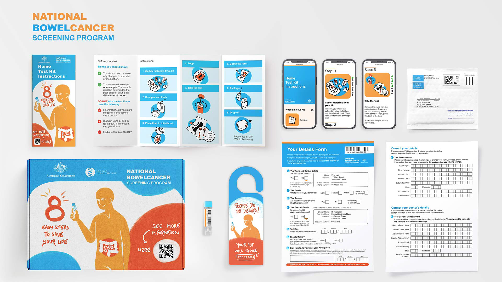
We proposed changes to the existing National Bowel Cancer Screening Program (NBCSP) based on research and user insights, with the end goal of increasing participation in the test. Developed in a team of five students, the outcome included materials created across mediums. It included a revised service/delivery model, branding, kit contents, instruction pamphlet, details form and a digital version of the instructions.
Introduction
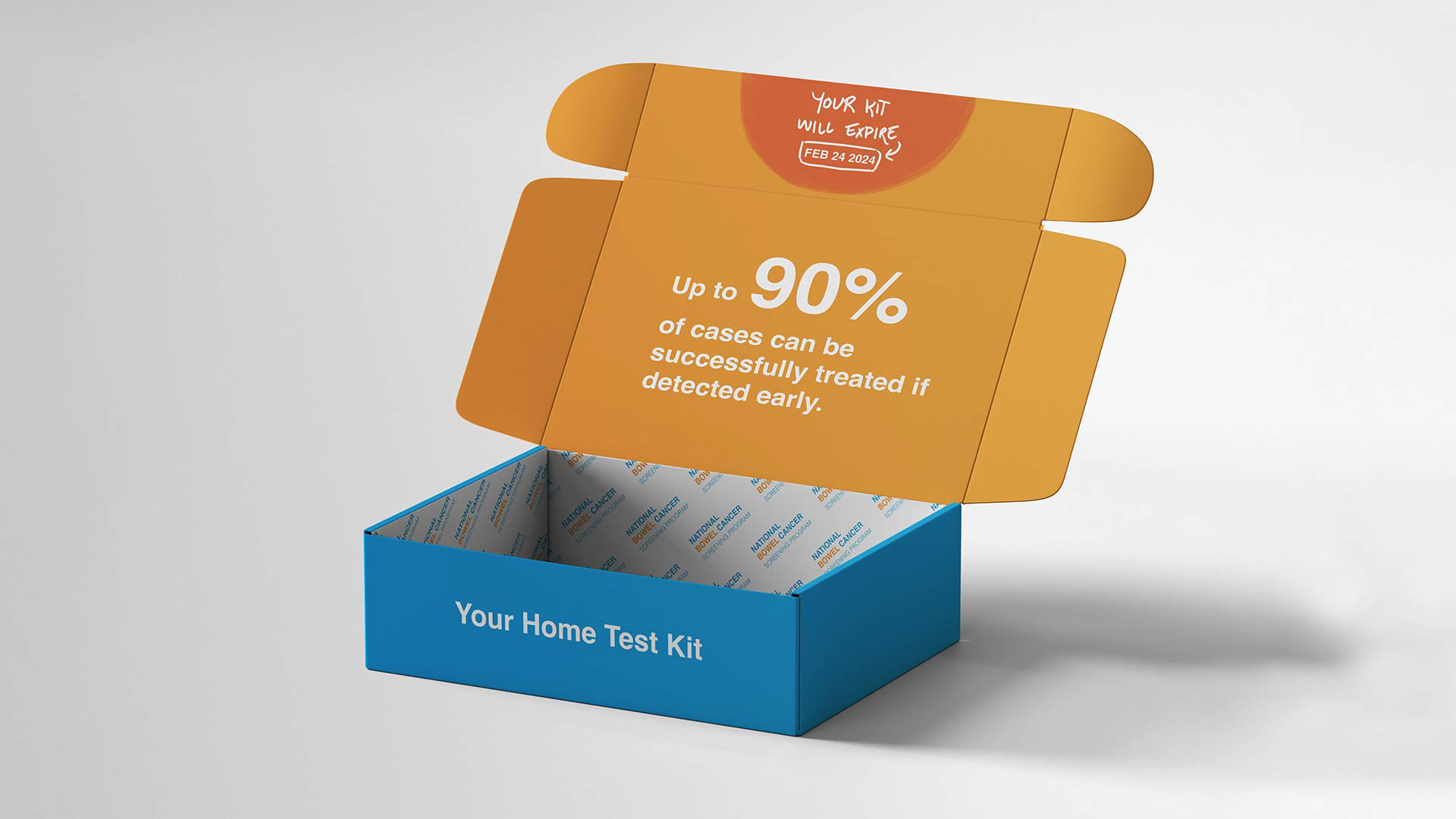
If detected early, 90% of bowel cancer cases can be successfully treated. So there is no doubt that the National Bowel Cancer Screening program is important. However nationally, the participation rate sits at only 40.9%.
Why is that?
Why is that?
The Aikenhead Centre for Medical Discovery commenced research into the possible integration of digital technologies into the process to increase participation. They connected with Swinburne University to investigate this topic for the 2023 UX Capstone project.
This project was a collaborative effort alongside EJ Watkins, Harrison Pawluk, Samuel Upham and Lorena Buturlin. My involvement focused on the service design and the form (+ test vial).
Initial Research
We started with an abundance of secondary research; conducting an expansive literature review, creating case studies and researching the target audience. After we all had a clear picture of the program at hand, we prepared for and conducted a focus group, aiming to identify:
- If digital technology integration would be adopted by users.
- Barriers and pain points to testing throughout the process.
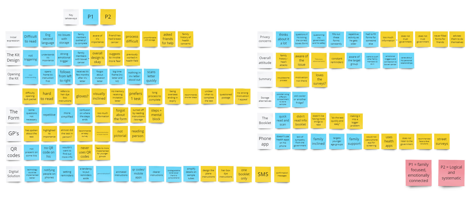
The Problems
We evaluated the findings of this focus group and identified four key components of the kit that are causing friction with users. The kit is overwhelming, the 'ick' factor around the storage of fecal matter, confusing instructions and the service model.
In earlier research, we found that negative attitudes around technology from the target audience were repeated resoundingly in the focus group. Participants stated that they would not like a digital app to manage the process and feel that apps and technology are imposed on older people by the younger generation. With this in mind, we decided to not hinge our project on developing digital technology-based materials as our core focus.

The Solutions
Based on these key findings, we developed some potential solutions that address these key issues. We focused on revising the service design, and the testing kit contents.
Service Design
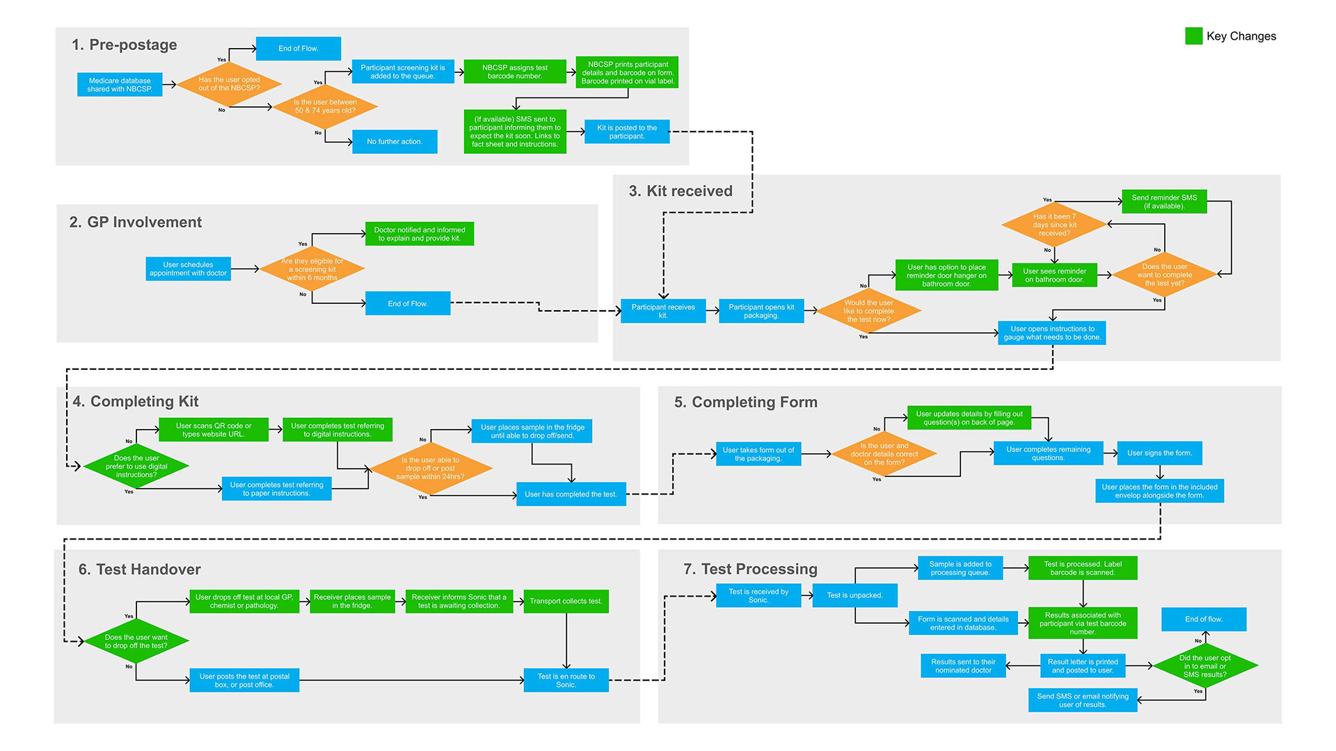
We mapped out the user journey of the existing kit and formed a series of recommendations for changes based on the above user insights. Systematic changes include stronger GP integration, transition to one testing vial, added reminder text messages, and optional drop-off at GPs, chemists or pathology clinics.
Branding & Instructions
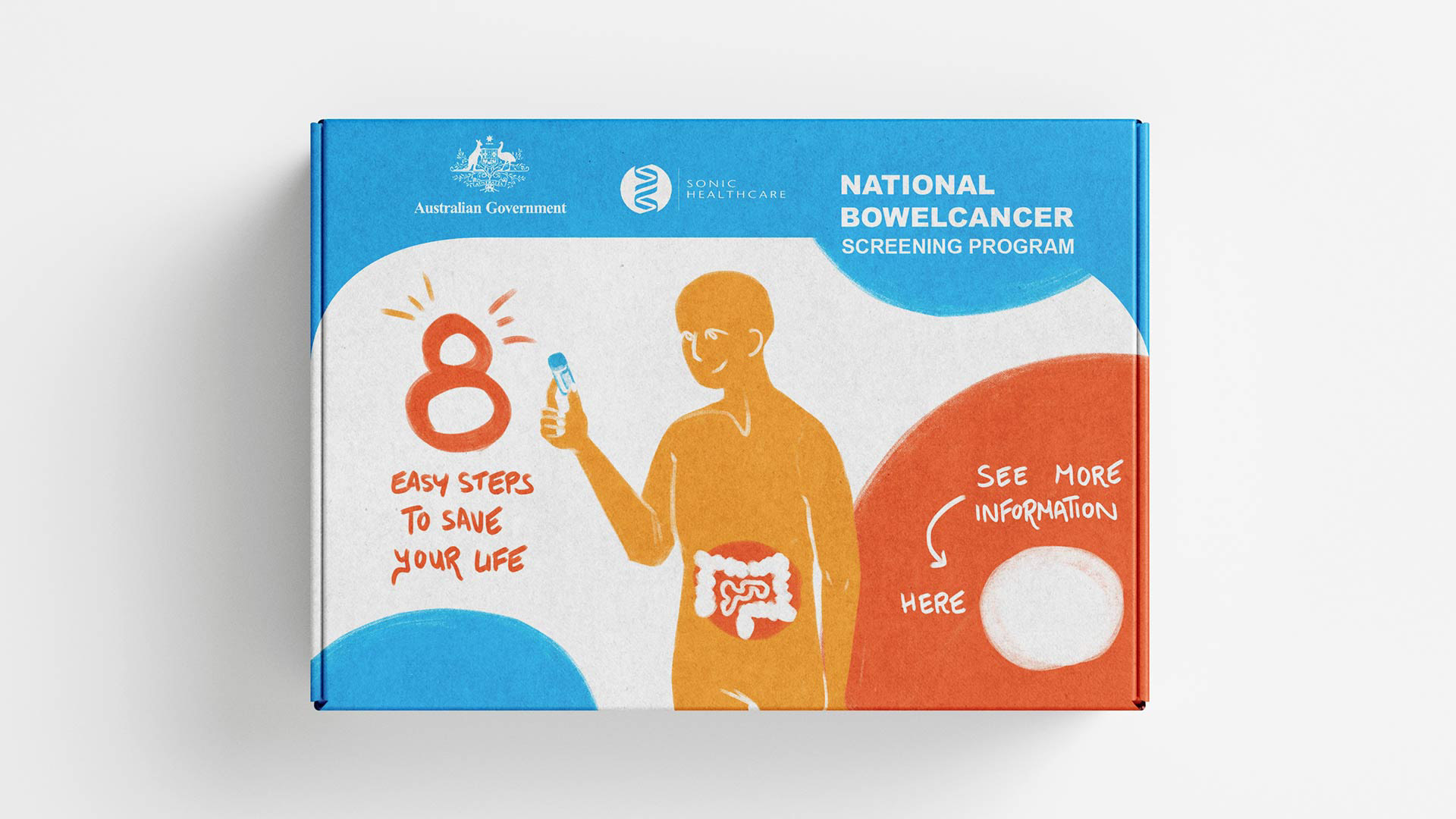
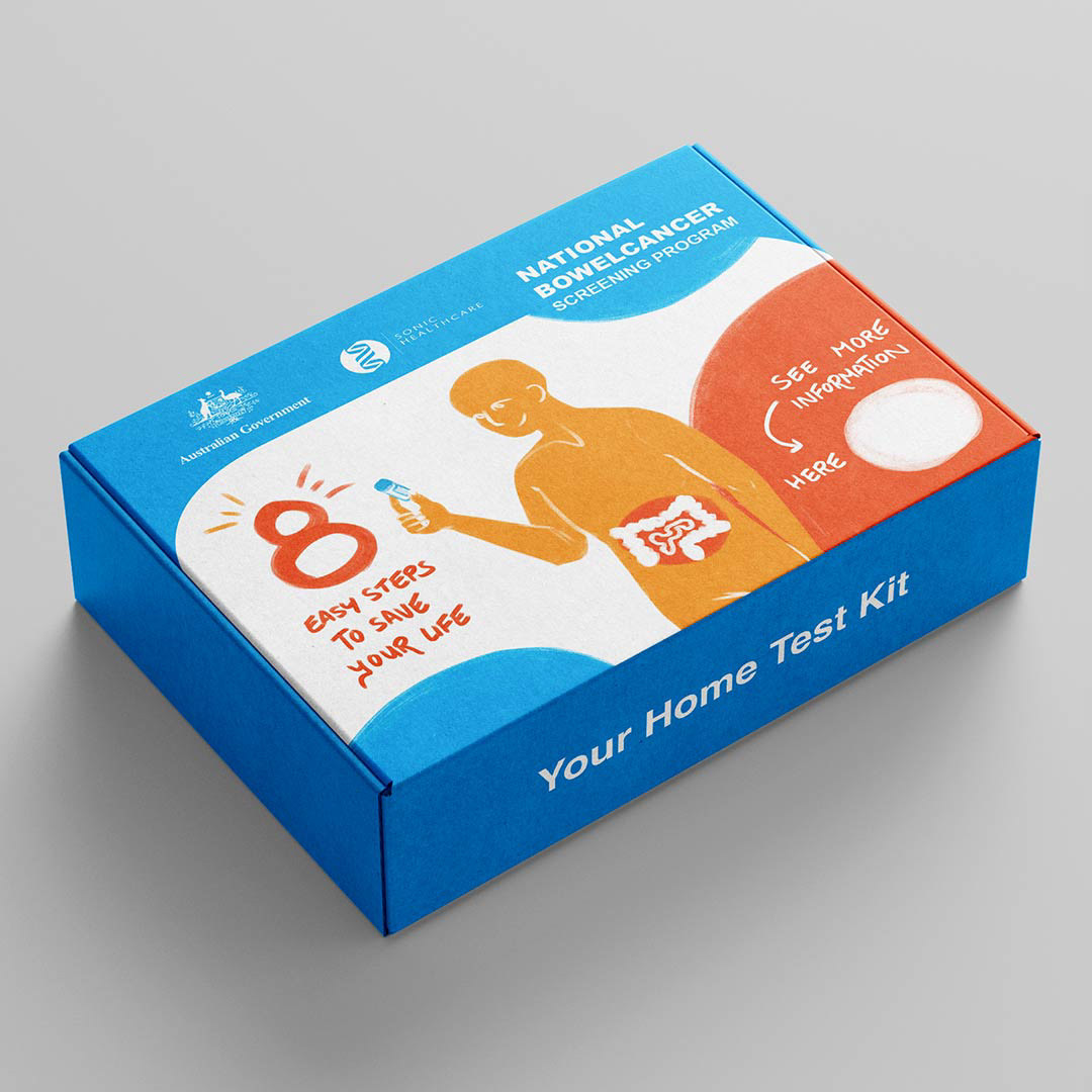
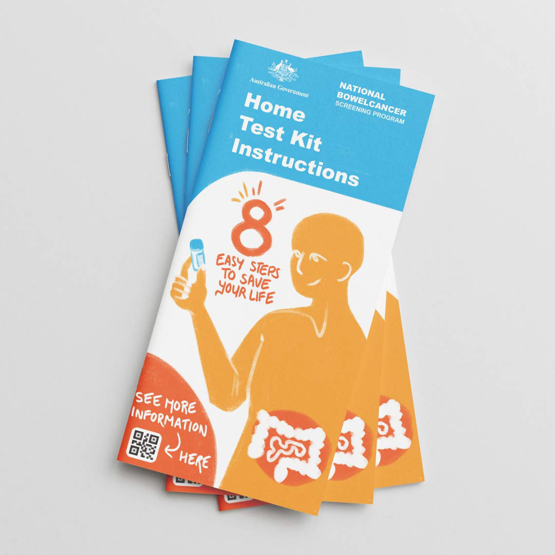
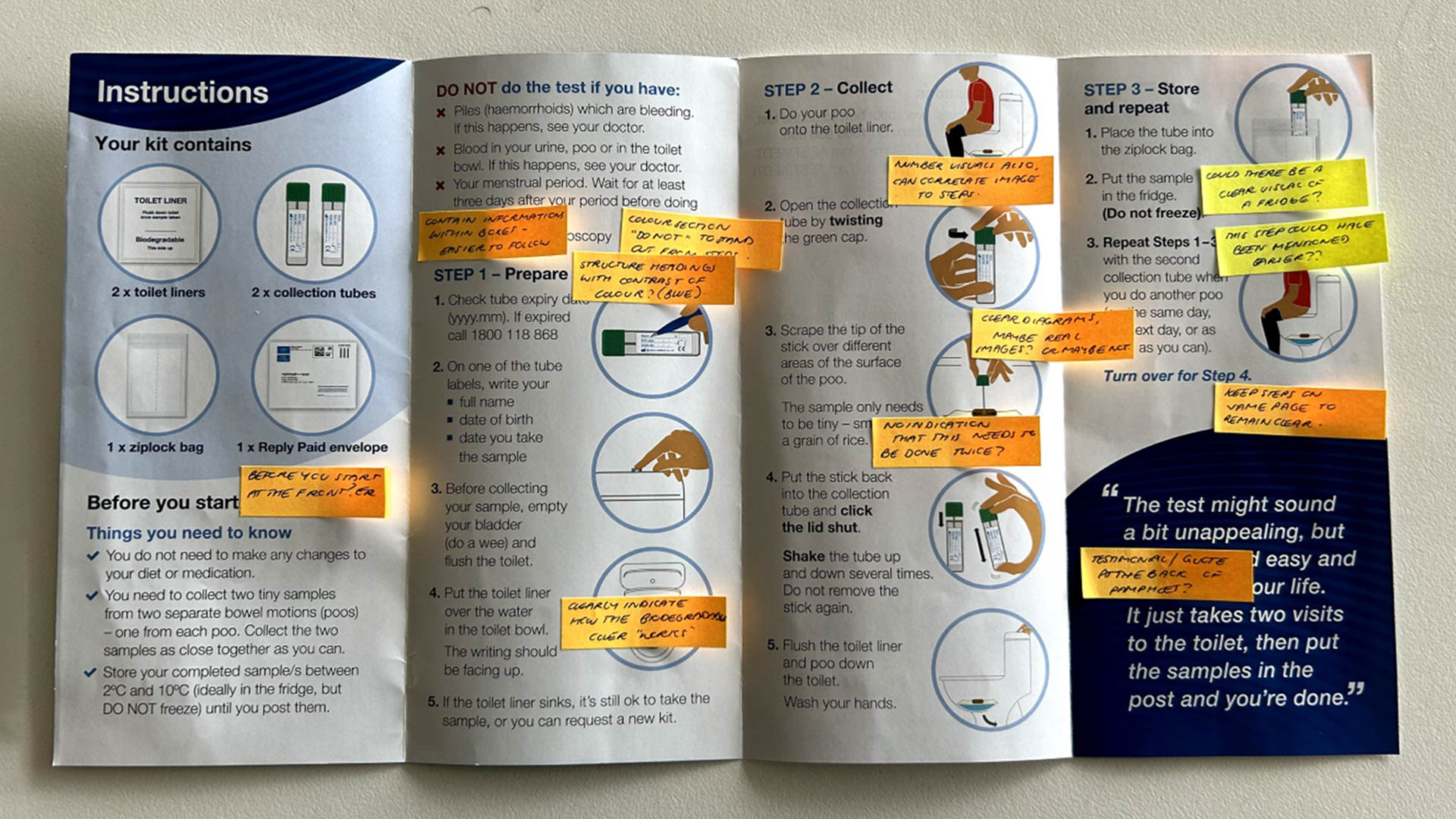
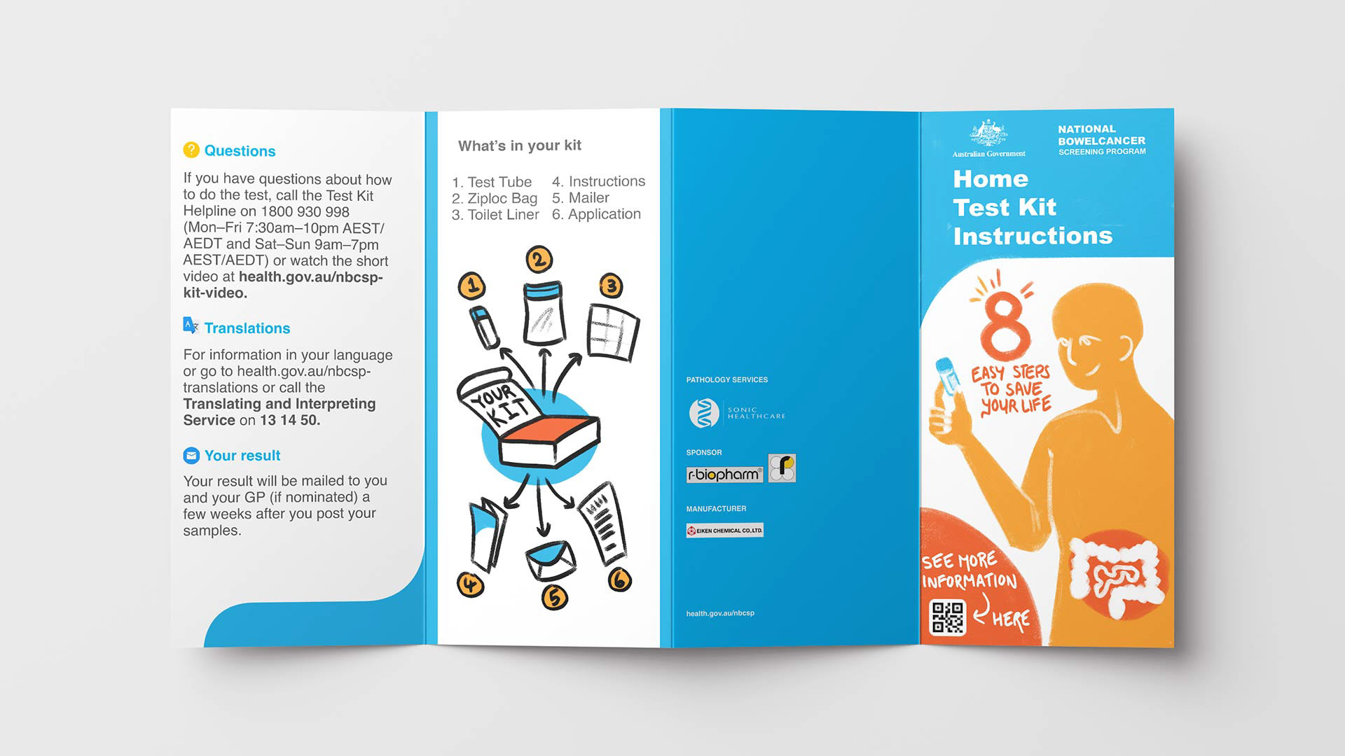
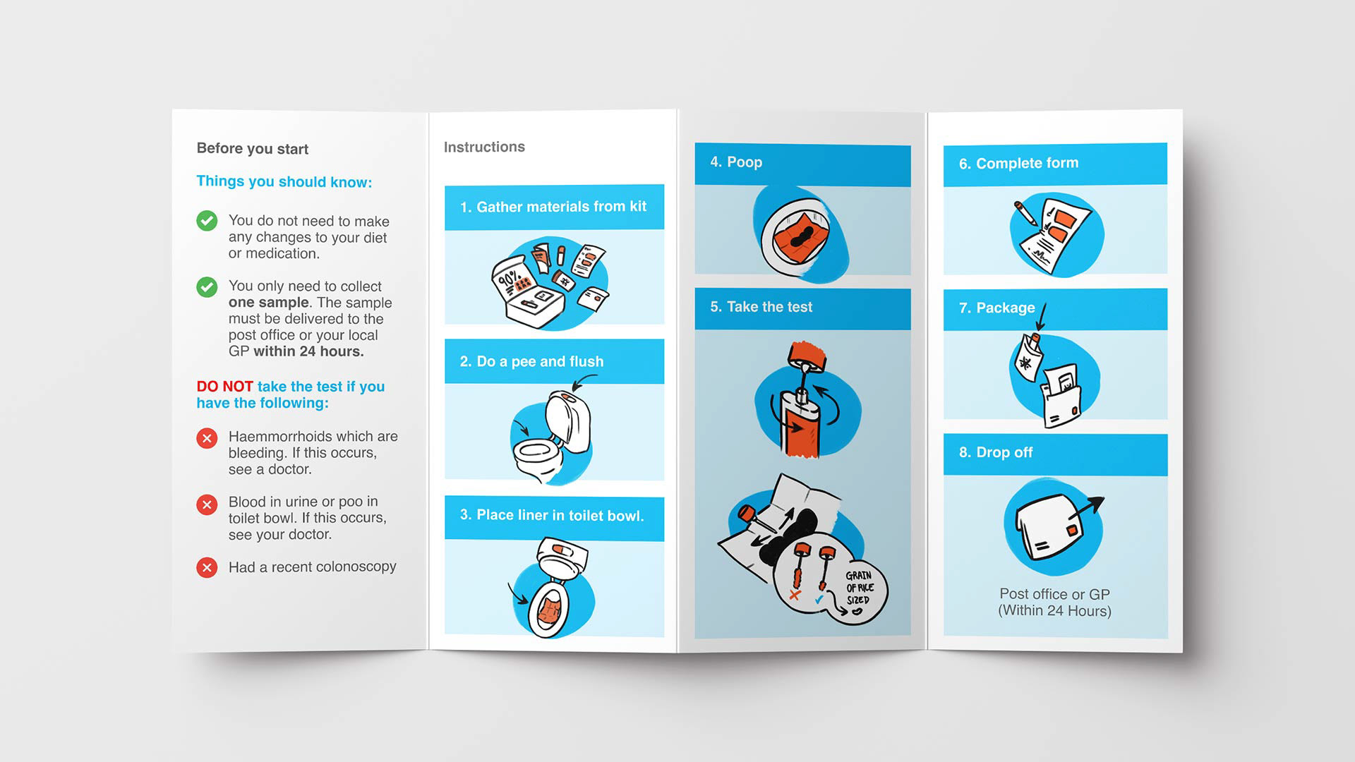
Users identified during focus groups that the existing kit did not convey a sense of urgency. We revised the branding to include some orange colours that give a sense of importance and warmth to the brand identity. The use of hand-drawn sketches aims to add a welcoming, personal touch. Since users felt the instructions were complicated and overwhelming, these have been revised and simplified to the bare essentials, inspired by instructions from the Manitoba bowel cancer screening test, and the likes of Ikea.
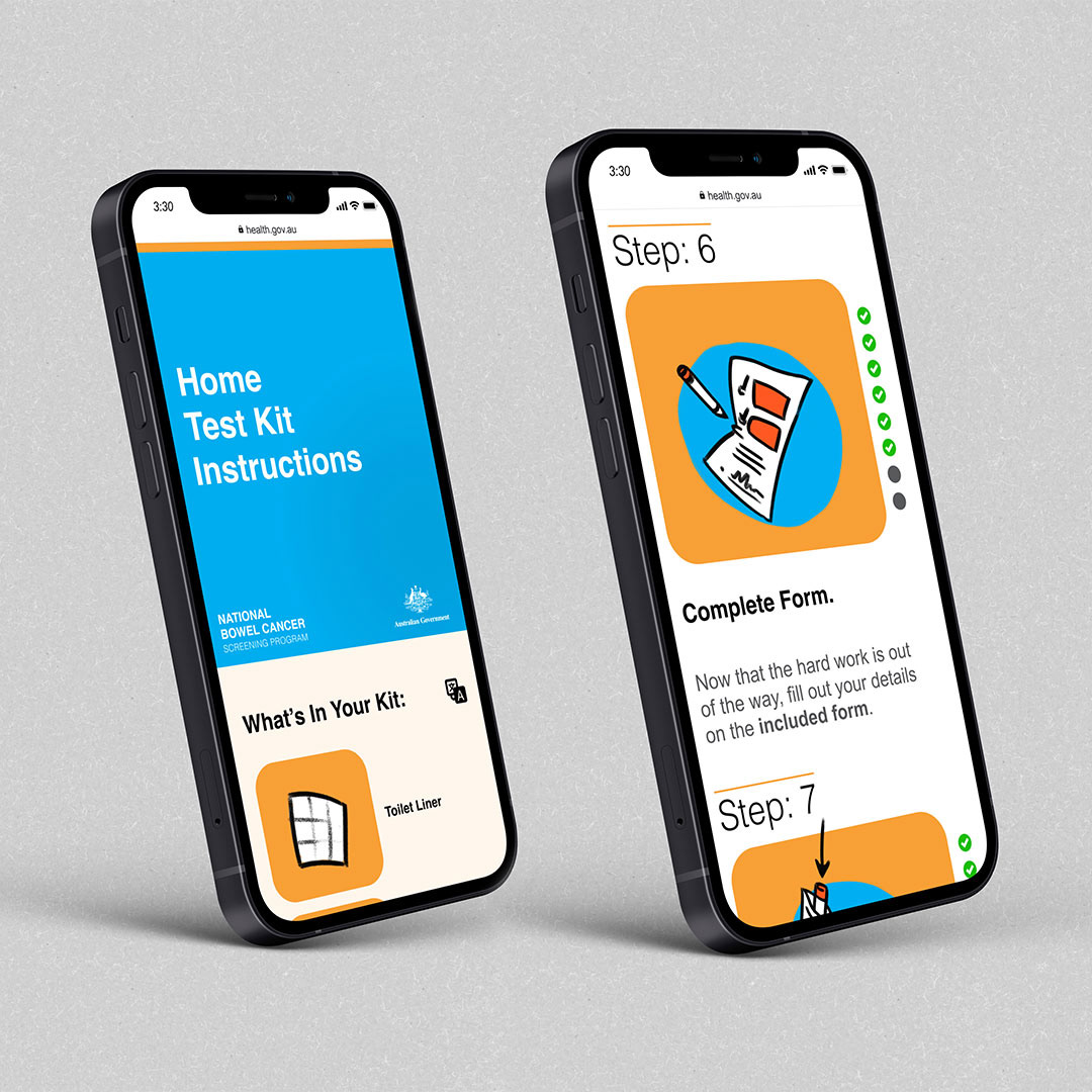
Digital instructions
The focus group responded positively to the concept of digital instructions, as it could make the process of completing the test more clear and easy to understand. We created a webpage accessible via a QR code that contained the instructions in a digital format, with a progression bar. It is here that users would be able to select a different language if needed.
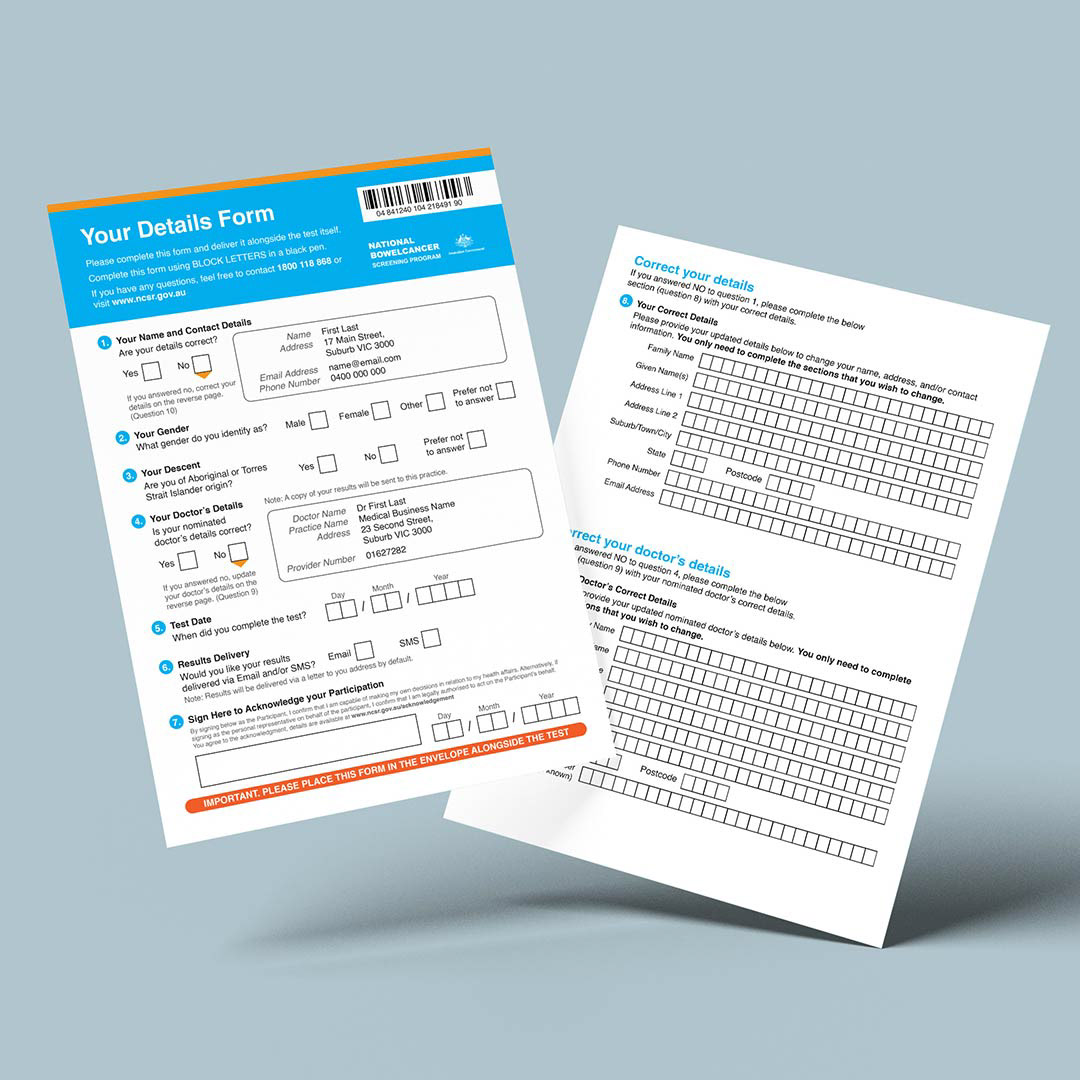
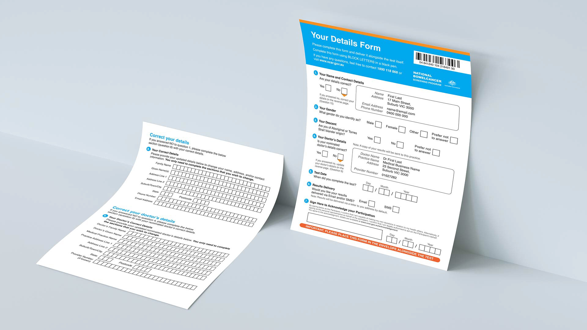
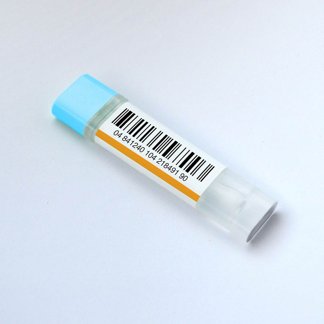
Form & Vial
Following with the theme of simplifying the overwhelming, we revised the form. This form is double-sided, rather than four pages long - having stripped out unnecessary and repetitive questions. If the user's pre-filled information is correct, only the front side of the form needs to be filled out.
We also integrated a test barcode number. This barcode is shared between the form and test vial and essentially removes the need for users to fill out further details on the vial itself. This reduces repetitiveness, aids accessibility, and adds a layer of perceived anonymity.
Door Reminder
This idea responds to the feedback that these kits are often forgotten about and expire. This door hanger can be placed on the bathroom door or even the fridge. It is simply designed to provide users with a friendly reminder to do their test, and inform the user as to when their kit will expire.

Packaging
Finally, the packet packaging has been replaced by a box. This box feels more important and meaningful than its earlier counterpart. It contains consistent branding, features a reassuring statistic right as the user opens it up, and allows for the contents to be more intentionally organised.